Fountain pen guide: your first page
A practical EYEYE fountain pen guide to starting, choosing paper, writing lightly and building a colorful notebook.
By EYEYE Journal · October 25, 2026
In this guide
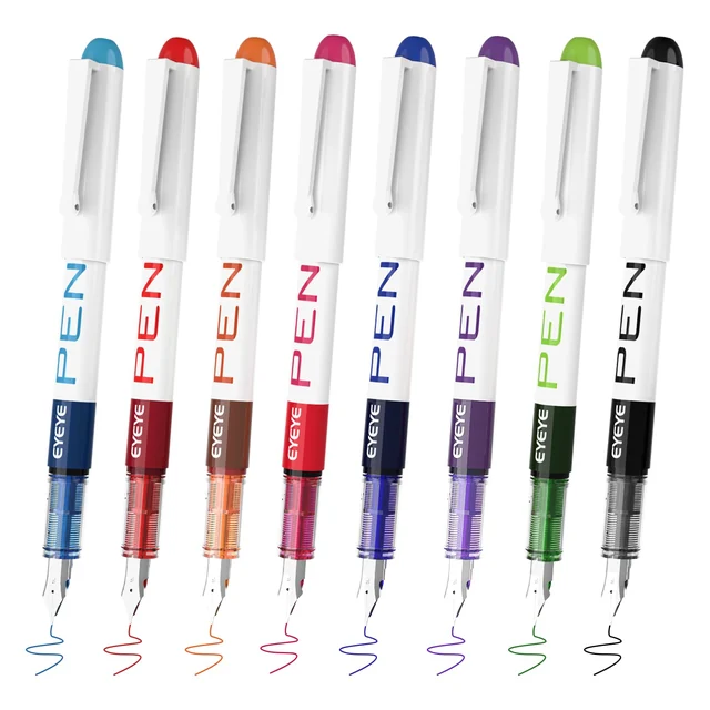
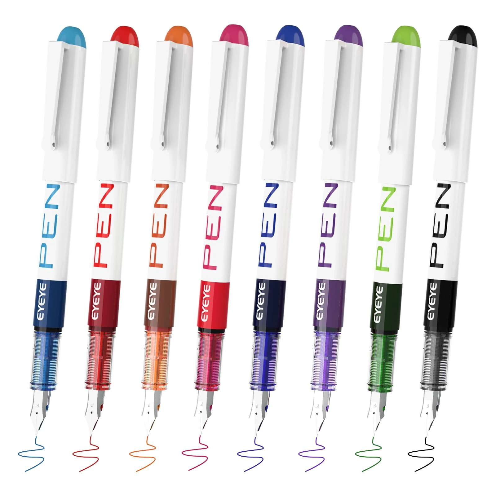
Know which kind of fountain pen you haveSet up a small, useful first writing testFind the nib position before changing your handwritingChoose paper by what it does, not only by its weightUse less pressure and a more consistent paceBuild a color system you can rememberMake an everyday journal page that invites a second visitImprove spacing before attempting fancy letteringAdapt the page if your hand crosses fresh inkKeep the pen ready between writing sessionsTroubleshoot one variable at a timeWrite a personal note with a clear page layoutKeep a useful record of colors and paper combinationsChoose a set around the pages you make most oftenTry a short practice plan you can actually finishA prefilled fountain pen lets you try the feel of a metal nib without choosing bottled ink, installing a cartridge or learning a filling system. The EYEYE eight-color, white-barrel set pairs disposable pens with fine stainless steel nibs. Start with one pen, an ordinary notebook and a little space to discover how the nib meets the page. Your first goal is comfortable, readable writing, not an elaborate alphabet.
This guide takes you from the first line to a useful daily writing routine. It explains grip, paper, color, simple lettering and the small adjustments worth making when a line looks uneven. The exercises are suggestions for your own practice; paper, handwriting and drying conditions differ. Compare the EYEYE fountain pen collection before choosing a pack, because barrel design, color assortment and nib description can vary between sets.
 View photograph ↗
Know which kind of fountain pen you have
The fine-nib EYEYE set considered here arrives filled and is described as disposable. That changes the setup: you do not need to buy an ink bottle, fit a converter or remove the nib to start writing. It also changes maintenance. Treat the body as a complete writing instrument rather than a container you are expected to open. Do not follow a refill tutorial intended for a different pen simply because both have a steel nib.
The nib is the metal part that touches the paper. Behind it, the feed brings ink toward that point. You will see a different shape from the small rolling ball at the end of a rollerball or gel pen. A fountain nib has an orientation: the upper face should remain generally facing upward while you write. Rolling the barrel between your fingers can change how the point contacts the page.
“Fine” describes a writing category, not a promise that every stroke on every sheet will have an identical width. The selected EYEYE listing describes a 0.5 mm fine point, but absorbent paper, writing angle and overlapping strokes can change the line you see. Nor does a fine stainless nib imply a flexible calligraphy nib. Use a light touch; do not spread the nib by pressing down for dramatic thick strokes.
Set up a small, useful first writing test
Use a stable surface with enough room for your forearm. Place a spare sheet beneath the page if you are testing an unfamiliar notebook. Keep the cap somewhere you can see it, away from an edge where it could roll off. Put the remaining colors aside for the moment. Starting with all eight at once makes it harder to work out whether a difference comes from your hand, the paper or the particular color.
Write the date and the pen color in a corner. Add three short lines: your name, a sentence you might normally write, and a row of small loops. Leave enough space between them to inspect the edges. You are looking for a continuous line, legible letter shapes and a comfortable grip. There is no need to fill a whole page before deciding that the paper is unsuitable.
Let the marks rest, then examine the reverse. A faint shadow of the writing is different from ink reaching the back surface. Keep this first test as a reference. When you try another notebook, repeat the same words and shapes. A familiar sample makes differences easier to see than a fresh decorative page whose lettering, spacing and color have all changed.
Find the nib position before changing your handwriting
Hold the pen in a relaxed version of your usual writing grip. Bring the nib to the paper at a comfortable slant rather than standing it almost upright. Make a short stroke, then a second one with a slightly different angle. Notice where the line becomes continuous without extra force. A small adjustment is usually more informative than repeatedly drawing over a hesitant mark.
Watch the nib as you form a few letters. If the barrel slowly turns in your hand, pause and return the upper face of the nib to its starting orientation. Avoid forcing your fingers into an uncomfortable pose merely to match a photograph. The useful position is one that lets the nib contact the paper steadily while your hand stays relaxed. Rest the paper at a slight angle if that helps your arm move naturally.
Keep your fingers far enough from the point that you can see the next letter. Do not pinch harder when a line stops. Lift the nib, check its orientation and try a fresh small stroke. A fountain pen should not require the heavy pressure sometimes used to make an unreliable ballpoint write. If the pen remains difficult to use, move to the troubleshooting checks below rather than turning practice into a struggle.
Choose paper by what it does, not only by its weight
A notebook can feel substantial yet still spread liquid ink along its fibers. Another sheet can be relatively light and keep a crisp line. Paper weight is useful information, but it does not tell you everything about surface texture, coating or absorbency. Test the notebook you actually plan to carry. Buying a specialized journal is optional; finding a combination you enjoy is the practical objective.
Look for three separate effects. Feathering creates tiny branches around the edges of a line. Bleed-through means ink reaches the reverse surface. Show-through, sometimes called ghosting, is the visibility of a dark mark through a thin sheet without ink necessarily reaching the back. These effects call for different decisions. Mild show-through may be acceptable in a casual notebook, while bleeding can interfere with writing on both sides.
Drying also deserves its own test. On some smooth surfaces the line stays wet longer; on absorbent paper it may dry sooner but appear less crisp. Try a short sentence, wait, then gently test a spare mark with a clean fingertip. Do this on a practice area, not your finished work. Keep your hands away from fresh text while you compare the result.
Swipe or scroll to compare the columns.
| What you see | What to check | Useful next step |
|---|---|---|
| Soft, branching edges | The same word on another paper | Choose the sheet with clearer edges |
| Ink on the back surface | A spare sheet beneath the page | Use one side or switch notebooks |
| A shadow through the paper | Whether reverse-side writing stays readable | Decide whether the appearance bothers you |
| Smearing after a pause | Your actual writing speed and hand position | Allow more drying space or compare another pen type |
Use less pressure and a more consistent pace
For the next exercise, draw a line of open circles without trying to make them identical. Aim for a light touch and steady movement. If your fingers tense, stop after a few circles and loosen your grip. Practice works better in short, attentive bursts than in a long session spent gripping the barrel tightly. Resting your forearm comfortably can help you move without steering every stroke with your fingertips.
Now write a sentence twice. On the first line, use your normal pace. On the second, slow slightly at corners and joins while keeping the pen moving through each letter. Compare legibility, spacing and how your hand feels. The slower line is not automatically better. You are finding a pace that allows you to think and write without repeatedly correcting letter shapes.
Do not try to make a darker patch by bearing down. If you want stronger visual emphasis, use a larger heading, a second color or a deliberate underline after the text is dry. Those choices give you control without asking a fine nib to behave like a broad marker. For variable line weight in a drawing, the EYEYE fineliner range offers a different way to choose marks.
View photograph ↗
Build a color system you can remember
The white-barrel assortment lists black, blue, light blue, purple, green, pink, orange and red inks. Make a swatch of each actual pen before assigning a role. A cap is a useful cue, but a line on your chosen paper tells you how the color will look beside your handwriting. Write each color name below its swatch so you can identify the pen later without comparing eight caps.
For a working notebook, start with three roles: one color for main notes, another for actions and a third for questions. Leave the other colors available for occasional diagrams or personal pages. A system that requires eight decisions during a meeting can become harder to use than a single pen. Color should reduce the time you spend finding information, not add a separate task to every sentence.
Pair each color with a word or symbol. An empty square can mean an action, and a question mark can identify something to investigate. This keeps the page understandable in a black-and-white photocopy or for a reader who distinguishes colors differently. Be especially careful with pale inks in small lettering. Reserve a less readable shade for a larger heading or a small decorative detail rather than essential instructions.
Make an everyday journal page that invites a second visit
Divide a page into three modest areas: what happened, what you noticed and what comes next. Give the first area most of the space. Use your main writing color for the body and one accent for headings. You do not need a drawn grid unless it helps you organize your thoughts. A short heading and an empty line can separate sections just as clearly.
Begin with something concrete: a conversation, a place you visited or a decision you made. Add a detail you would otherwise forget, such as a phrase, a color or a question. This gives the page a purpose beyond testing pens. Leave room for a later note instead of filling every margin immediately. A small addition tomorrow can make the journal more useful than an entirely finished page today.
If you enjoy decoration, add it after the writing. Try a simple border around the date or a small sketch of an object from the day. Keep your hand clear of wet text and recap each pen before switching colors. The fineliner drawing guide explains line patterns and small illustrated projects that can sit beside fountain pen notes.
Improve spacing before attempting fancy lettering
Clear handwriting depends on more than attractive individual letters. Word spaces, line spacing and consistent letter height have a large effect on how quickly a page can be read. Choose a short sentence and write it three times with slightly different spacing. Look at it from an ordinary reading distance. Select the version that feels easiest to follow, even if its letters are less decorative.
Try a row of lowercase letters with similar shapes, such as a, c, d and o. Keep their rounded portions approximately the same height. Then write a few words containing those letters. The second step matters: isolated practice does not always transfer automatically to normal writing. Use a ruled or dotted page if it helps, but avoid squeezing every letter into a rigid box that makes your hand tense.
For a title, increase the size and give the words more breathing room. A fine fountain nib can make neat monoline lettering, where most strokes have a similar visual weight. If you want a thicker effect, draw a separate outline and fill it carefully after testing the paper. Do not imitate flexible-nib calligraphy by forcing the nib apart on downward strokes.
Adapt the page if your hand crosses fresh ink
Left-handed writers may find that their hand travels across newly written text, but individual grips and page positions vary. Begin by observing your own movement rather than copying a universal “left-handed” setup. Turn the page a little, adjust where it sits on the desk and see whether your wrist can remain comfortable while staying clear of the line. Avoid adopting an awkward posture solely to preserve one notebook-and-pen combination.
A spare clean sheet can keep the side of your hand from rubbing against an older part of the page, but it is not a substitute for allowing fresh ink to dry. Plan diagrams from the side farthest from your resting hand when practical. When switching colors, use the pause to recap the pen and let the previous marks settle before reaching across them.
Test any claim about quick drying with your own paper and writing pace. If a fountain pen does not suit a particular fast note-taking task, try a different writing format. The rollerball, gel and fountain pen comparison provides a practical method for evaluating the options without assuming that one category works best for everyone.
Keep the pen ready between writing sessions
Replace the cap when you pause or finish. It is easy to leave a pen uncapped while reading a long passage or answering a message, especially when several colors are spread across a desk. Make capping part of the transition: finish the line, cap the pen, then turn to the next task. Check that the cap is securely seated rather than balancing loosely over the nib.
Store pens where they will not be crushed, bent or exposed to excessive heat. A simple case keeps the nib area protected from keys and other hard objects. Carry only the colors you will use instead of packing every pen by default. At a desk, a tray gives loose caps and pens a defined place and makes it easier to notice one that has been left open.
Keep the nib away from fingers, fabric and other surfaces that you do not want marked. If you see ink on the outside of the grip, wipe it carefully with suitable disposable material while protecting the desk. Avoid opening the body, pulling out the feed or applying household chemicals. A disposable pen is not a good starting point for repair experiments that could damage the point or spill its ink.
Troubleshoot one variable at a time
If a line skips, start with the simple checks. Is the pen oriented correctly? Are you rotating it during a stroke? Does it behave the same way on a second sheet? Is the nib visibly damaged? Testing one change at a time prevents a small issue from turning into a confusing set of experiments. Use fresh paper for each check so earlier marks do not obscure what happened.
A scratchy sensation deserves a pause, particularly if it began after a drop. Do not drag the nib repeatedly across the page or press harder in an attempt to smooth it. Compare a second pen using the same gentle grip. If one pen remains noticeably difficult while the other writes normally, set the troublesome pen aside and use the order's available support options if appropriate.
Swipe or scroll to compare the columns.
| Issue | First check | Avoid |
|---|---|---|
| Intermittent line | Nib orientation, then another paper | Increasing pressure repeatedly |
| Ink smears | Drying time and hand path | Assuming every notebook behaves alike |
| One pen feels unusually rough | Visible damage and a gentle comparison | Bending or sanding the nib |
| Pen seems empty | Any visible ink indicator and normal writing check | Forcing open a disposable barrel |
Write a personal note with a clear page layout
A short handwritten note is a useful first finished project because it asks the pen to do an ordinary job. Choose a sheet you have already tested and sketch the layout mentally before writing. Leave room at the top for a greeting and at the bottom for your name. If the note will go into an envelope, check the fold position so the most important line does not sit directly across it.
Draft the message separately if the wording matters. A thank-you note can be specific without being long: name what the person did, explain what it meant to you and add a personal detail. On the final sheet, keep the body in one readable color. An accent can appear in the greeting or a small drawing, but there is no need to assign a new color to every sentence. The message should remain the part the recipient notices first.
Allow the writing to dry before folding. Check the back for bleed-through and inspect the fold for transfer after a gentle first close. If you plan to address the envelope with the same pen, test that paper separately; envelope stock can behave differently from the sheet inside. Do not assume the ink will withstand rain or rubbing during delivery. Choose a suitable addressing method for the conditions the envelope will face.
Keep a useful record of colors and paper combinations
A small reference page saves repeated experiments when you move between notebooks. Give each paper a short name, then add a line of writing, a few closely spaced strokes and a filled square in the same color. Record whether the reverse remains usable and whether the line stayed crisp. Describe what you actually saw rather than assigning a vague score such as “good.” A note that says “clear letters, reverse visible but readable” helps you choose later.
Keep the record compact. You do not need a laboratory chart or an exact drying-time claim for every session. Use the same ordinary pause before checking a spare mark and note any obvious smearing. If the result changes after you alter your writing size or pace, add that observation rather than erasing the first one. The page is a record of your working combinations, not a universal rating for the pen.
Store the swatch page with the pens or at the back of your main notebook. When a color becomes hard to distinguish from another, compare a fresh mark with the labeled sample. If you share a set, let each person make a small test in their own notebook. One person's favorite combination may feel different to someone who writes smaller letters or moves a hand across the page more quickly.
Choose a set around the pages you make most often
Before adding more pens, look through a week of your writing. Count how often you used an accent color and how often you needed only a dark, readable line. Consider whether you prefer a small set at your desk or a single pen in a bag. These observations are more useful than choosing the largest assortment simply because it contains more colors.
Check the exact pack description, including barrel style, nib label and ink assortment. Similar product photographs can show different configurations. If you are buying for someone else, a note explaining that the pens are prefilled and disposable can prevent confusion about cartridges or bottled ink. Include a sheet of the paper you enjoyed using, with a small swatch in the corner, so the recipient has an easy first place to try the set.
Try a short practice plan you can actually finish
On the first day, make your paper test and write five ordinary sentences. On the next, focus on the space between words. Follow with a small color key, a one-page journal entry and a handwritten note to yourself. Each session can take only a few minutes. Keep the earlier pages so you can see whether the writing becomes more comfortable, rather than judging every new line in isolation.
For a final exercise, copy a short piece of your own writing into a clean page. Choose a title, leave generous margins and use only two colors. Read it again after it dries. Mark one thing that improved and one thing to practice next, such as letter height or keeping the nib from rotating. A specific observation gives the next session direction.
Once you know which colors and page format you enjoy, choose your next supplies around that routine. A daily writer may want a dependable main color; a journal keeper may value an assortment. Browse EYEYE fountain pens, or compare rollerball pens and gel pens for tasks that call for a different feel. Keep the first successful page as your starting point.
View photograph ↗
Find the pen for your next page.
Compare the current EYEYE collection by format, ink color and pack.
Explore fountain pens →